July 25, 2026
Best Mobile Device Management: Top Tools for SMBs in 2026Find the best mobile device management solution for your SMB. Our 2026 guide compares the top 10 tools on security and compliance.
Read Full Post%20(1).webp)
Usman Malik
Chief Executive Officer
June 10, 2026
Most business leaders don't have a data shortage. They have a decision shortage.
The usual pattern looks familiar. Sales lives in the CRM. Finance exports reports from the accounting system. Operations tracks work in spreadsheets. Someone in management asks a simple question such as “Which customers are most profitable?” or “Why are service delays increasing?” and the team spends half a day stitching together files that don't quite line up.
That isn't an analytics problem in the abstract. It's an operating model problem. When reports are fragmented, leaders rely on lagging information, inconsistent definitions, and instinct. For Canadian SMBs, that gets riskier in regulated sectors where compliance, auditability, and operational discipline matter just as much as growth.
Canada has worked with structured data for a very long time. The first national census in 1871 created a formal statistical baseline for population, housing, and economic planning, showing early use of consistent data collection for public decision-making, as described in UiPath's overview of data analysis examples. The lesson still holds for business. Consistent data over time creates the basis for strategy.
That matters because many SMBs still treat reporting as an afterthought. A monthly spreadsheet pack might satisfy a board meeting, but it won't help a clinic reduce appointment bottlenecks, a manufacturer understand downtime patterns, or a finance team spot margin erosion early enough to act.
The first major data initiative often starts with friction, not ambition.
A good analytics and reporting programme fixes that by creating one repeatable path from source data to decision. If you want a useful outside perspective on why cloud delivery changed business intelligence adoption, F1Group's cloud BI insights are worth reviewing alongside your own planning.
Modern reporting isn't just about prettier dashboards. It's about turning raw operational activity into a workflow that leaders can trust and act on. That usually means centralising data, standardising business definitions, and giving each department a clear view of the few measures that drive performance.
Practical rule: If a report can't answer “what changed, why it changed, and who needs to act,” it's a chart, not a management tool.
For many organisations, the best first move is narrower than expected. Don't start by trying to visualise everything. Start with a handful of business questions, then design the pipeline behind them. CloudOrbis outlines that approach well in its data management and analytics services, which focus on aligning data handling with operational use rather than treating analytics as a standalone software purchase.
A lot of confusion starts with the vocabulary. Leaders ask for analytics when they really mean reporting. Teams build dashboards when the business actually needs diagnosis and forecasting.
The easiest way to separate the two is to think about a car.
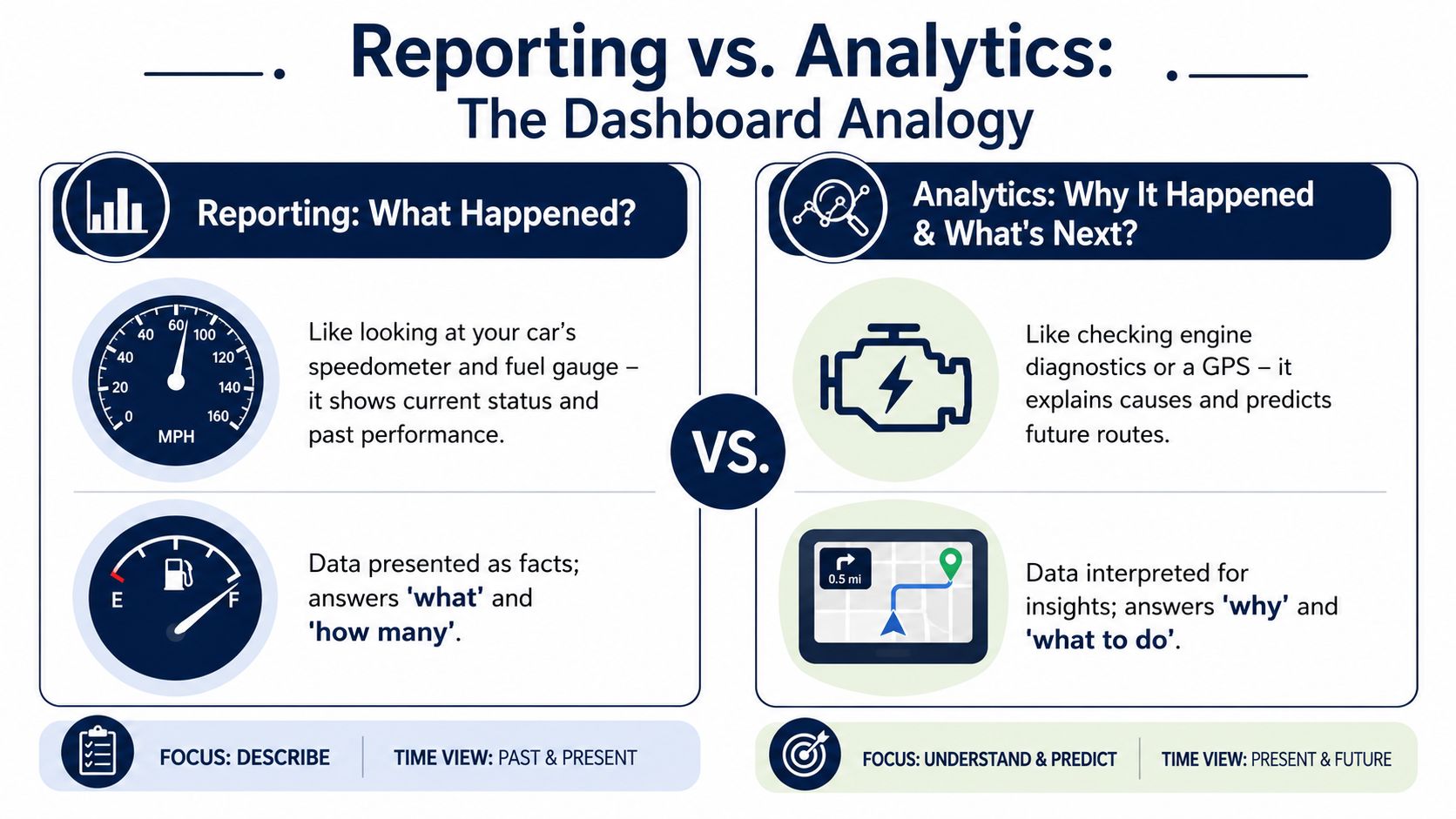
Your speedometer, fuel gauge, and warning lights tell you the current state of the vehicle. They're useful because they summarise what's happening now and what has already happened.
Business reporting works the same way. It answers questions like:
Reporting is essential. Without it, the business is driving blind. But it has limits. A dashboard can tell you that a metric moved. It usually doesn't explain the cause or recommend the next move.
Analytics goes beyond display. It asks why something changed, what is likely to happen next, and what action makes the most sense.
A healthcare clinic might see rising wait times in a report. Analytics examines scheduling patterns, provider availability, and no-show trends to isolate the cause. A manufacturer might see delayed orders in a dashboard. Analytics traces the issue to inventory timing, supplier inconsistency, or line scheduling.
That distinction becomes clearer when you apply the four-layer model described in this peer-reviewed overview of analytics maturity.
| Layer | Core question | Practical business use |
|---|---|---|
| Descriptive | What happened? | Monthly sales, service volumes, utilisation summaries |
| Diagnostic | Why did it happen? | Root-cause analysis, drill-down by team, site, or product |
| Predictive | What is likely to happen? | Forecasting demand, staffing pressure, or cash timing |
| Prescriptive | What should we do? | Reallocation, intervention planning, prioritisation |
Most SMBs begin with descriptive reporting because it's the fastest to produce. That's fine. The mistake is staying there too long.
When leaders only fund dashboards, they get polished summaries but not better decisions. When they invest in the full chain, from clean data to diagnostic and predictive use, the reports become operational tools rather than executive wallpaper.
A similar discipline applies in customer systems too. Businesses often collect a lot of CRM data without turning it into action. CloudOrbis touches on that gap in its article on CRM and small business, where process design matters as much as the software itself.
Analytics and reporting work best together. Reporting tells you where to look. Analytics tells you what to do.
The fastest way to waste an analytics investment is to build dashboards before agreeing on KPIs.
That sounds obvious, but it happens constantly. Teams connect data sources, create visuals, and only later realise that nobody agreed on what success looks like. In regulated industries, that's more than inefficient. It can create audit problems, weak controls, and arguments over which number is correct.
For Canadian organisations, practical reporting should centre on auditable regulatory and operational KPIs, with dashboards that show the KPI, its baseline, the driver behind any variance, and the intervention required. That workflow-oriented approach is outlined in DashThis guidance on data analysis reports.
In plain terms, a strong KPI does four things:
Different departments need different KPIs. The key is to avoid vanity metrics and choose measures that influence cost, service quality, compliance, or growth.
| Function | KPI examples | What leadership can do with it |
|---|---|---|
| Operations | Machine uptime, order fulfilment time, backlog age | Spot bottlenecks, improve scheduling, reduce disruption |
| Security and compliance | Mean time to detect, audit pass status, control exceptions | Prioritise remediation and strengthen oversight |
| Finance | Cash flow forecast accuracy, days sales outstanding, margin by customer | Manage liquidity, collections, and profitability |
| Healthcare | Patient wait times, appointment no-show patterns, referral processing time | Improve throughput and patient experience |
The important detail isn't the label. It's the chain underneath. If “order fulfilment time” comes from three systems with different timestamps, the KPI isn't ready yet. If “audit pass status” depends on manual emails and disconnected evidence, the dashboard won't solve the underlying weakness.
A practical KPI review sounds less like a software demo and more like an operating meeting.
If your dashboard shows a red metric but nobody knows who owns it or what happens next, the KPI isn't finished.
For finance teams exploring AI-assisted discovery in expense and transaction workflows, it can help to explore ReceiptsAI's AI capabilities as one example of how automation can surface patterns that manual review often misses. The same principle applies broadly. AI is useful when the underlying definitions and controls are already sound.
The businesses that get value from analytics and reporting usually tie KPI design directly to process improvement. That's why work on business process optimization often belongs in the same conversation as dashboard planning. A KPI should expose where the process breaks, not just decorate the problem.
Most failed analytics projects don't fail because the charts looked bad. They fail because the underlying system was assembled in the wrong order.
Teams often jump straight to Power BI or another visual layer, only to discover that source systems conflict, fields are incomplete, and nobody owns the definitions. A durable rollout works better when you treat analytics and reporting as a sequence.
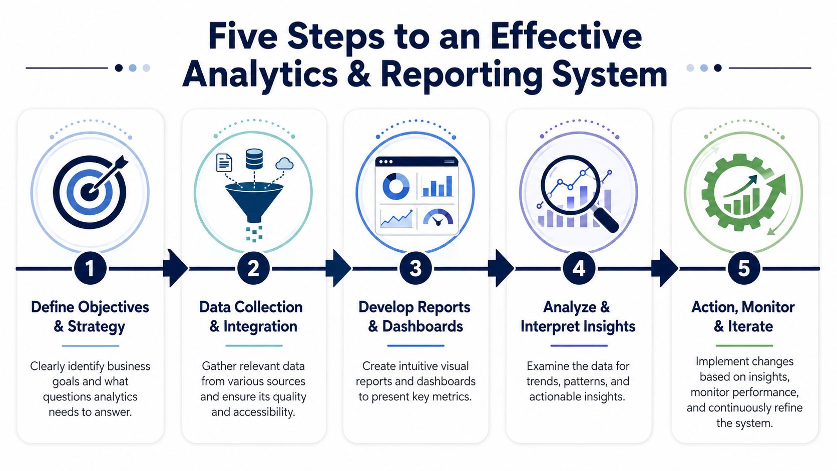
Define the business questions first
Start with a short list. Which service lines are most profitable? Where do delays enter the order cycle? Which controls need audit-ready evidence? If the question isn't clear, the data model won't be clear either.
Connect the source systems
Common SMB sources include Dynamics 365, Microsoft 365, ERP platforms, finance tools, service desk systems, and spreadsheets that haven't yet been retired. The point here isn't to ingest everything. It's to identify the systems of record for each important measure.
Clean and model the data
ETL or ELT work is performed here. Data is extracted, transformed, standardised, and loaded into a central model. Dates must match. Customer names must resolve consistently. Duplicates and missing fields need explicit handling.
A useful analogy is food preparation. Raw ingredients can be excellent, but if they arrive unwashed, unlabeled, and scattered across the kitchen, dinner will be chaotic. Data modelling is the mise en place of analytics.
Build dashboards for decisions, not decoration
A good dashboard is designed around audience and action. Executives need trend and exception visibility. Department managers need drill-down. Front-line teams need operational cues they can use daily.
Put governance in place before self-service spreads
This is the step many organisations skip. It's also the one that protects trust. As analytics adoption rises, weak governance creates a real risk that teams will make faster decisions on weaker data if ownership, definitions, and validation don't keep up, as noted in Luzmo's discussion of analytics blind spots.
Governance sounds abstract until you break it into a few practical controls:
Strong reporting doesn't come from more dashboards. It comes from fewer ambiguities.
If you're planning this as an organisation-wide initiative, the work often overlaps with broader IT strategy and consulting, because data architecture, security, cloud planning, and business process ownership all meet in the same project.
For most SMBs, the tool question shouldn't start with “What is the most advanced analytics platform?” It should start with “What stack will our team use, support, and govern well?”
That's where the Microsoft ecosystem has a practical advantage. Many Canadian organisations already run parts of the business on Microsoft 365, Azure, Teams, Excel, and often Dynamics 365. Using connected tools lowers friction. It also reduces the number of handoffs between systems.

Power BI is usually the front end. It turns modelled data into dashboards, management reports, and drill-down views for different audiences. It's strong when the business already lives in Excel and Microsoft 365 because the learning curve is more manageable than with a disconnected specialist platform.
Dynamics 365 contributes core business data. Sales pipelines, service cases, customer interactions, finance records, and operational transactions can feed a shared reporting model without the usual export chaos.
Microsoft 365 provides a lot of overlooked context. Teams activity, SharePoint-based document workflows, lists, and user collaboration patterns often matter when leaders want to understand service delivery, internal bottlenecks, or adoption issues.
Azure supports the middle layer. That includes data integration, storage, warehousing, security controls, and scalable processing. It gives SMBs room to grow without rebuilding the architecture every time reporting demands become more complex.
The history of analytics moved from static summaries to dynamic, scalable systems that support collection, aggregation, analysis, and visualisation as one workflow, as outlined in RudderStack's history of analytics. That's exactly why integrated ecosystems matter.
An isolated BI tool can still produce good charts. But once you need security alignment, governance, shared identity, cloud scalability, and operational integration, disconnected point products usually create more maintenance than value.
Here's the trade-off in simple terms:
| Approach | Strength | Limitation |
|---|---|---|
| Standalone BI tool | Fast to trial for one department | Harder to govern and scale across the business |
| Microsoft-based stack | Better alignment with productivity, identity, and cloud services | Requires stronger upfront architecture and role clarity |
Microsoft Copilot introduces a useful shift in how non-technical users interact with data. People can ask questions in natural language, summarise patterns faster, and reduce the friction of digging through dashboards. But it's not a substitute for disciplined data design.
If the source model is messy, Copilot only helps users reach confusion faster. If the model is clean, it becomes a practical accelerator.
For SMBs that already depend on Microsoft, that's why the ecosystem is often the sensible default. CloudOrbis Inc. is one example of a provider that works across Microsoft 365, Dynamics 365, Azure, and related data initiatives for SMB environments. For a broader look at how these tools fit smaller organisations, the company's piece on Microsoft for small business is a useful reference.
A reporting project becomes valuable when it changes behaviour.
Consider a hypothetical Canadian manufacturer. Before an analytics initiative, the leadership team reviews weekly production spreadsheets, separate purchasing reports, and emailed updates from the floor. Downtime patterns are hard to compare. Supply issues are identified late. Finance sees the cost impact after the fact.
After building a modest but disciplined analytics and reporting model, the company tracks downtime causes, supplier-related delays, and fulfilment pressure in one view. Managers stop debating whose spreadsheet is right. They start acting on recurring patterns. Maintenance planning improves. Purchasing gets earlier warning. Finance can forecast with more confidence because operational signals arrive sooner.
That's the true ROI. Not the dashboard itself. The shorter gap between signal and response.
The shift is simple to describe and hard to fake. Reporting starts as a cost centre when it produces static output. It becomes a growth tool when it improves timing, quality, and confidence in decisions.
If your organisation is still assembling management insight from disconnected files, the next step isn't to buy more charts. It's to define the business questions, clean up the data path, and choose a toolset that fits how your teams already work.
If you're ready to turn fragmented reports into a practical roadmap for decision-making, CloudOrbis Inc. can help you assess your current systems, identify the right KPIs, and map a Microsoft-aligned analytics and reporting approach that fits your compliance, security, and operational needs.
July 25, 2026
Best Mobile Device Management: Top Tools for SMBs in 2026Find the best mobile device management solution for your SMB. Our 2026 guide compares the top 10 tools on security and compliance.
Read Full Post
July 24, 2026
IT Infrastructure Optimization: A Practical Roadmap for SMBsA step-by-step IT infrastructure optimization roadmap for SMBs covering discovery, network, cloud, security, KPIs, and compliance.
Read Full Post
July 23, 2026
How to Use Microsoft 365 Copilot: A 2026 GuideLearn how to use Microsoft 365 Copilot step by step in 2026. Covers licensing, security, integration, prompt workflows, & ROI for Canadian firms.
Read Full Post